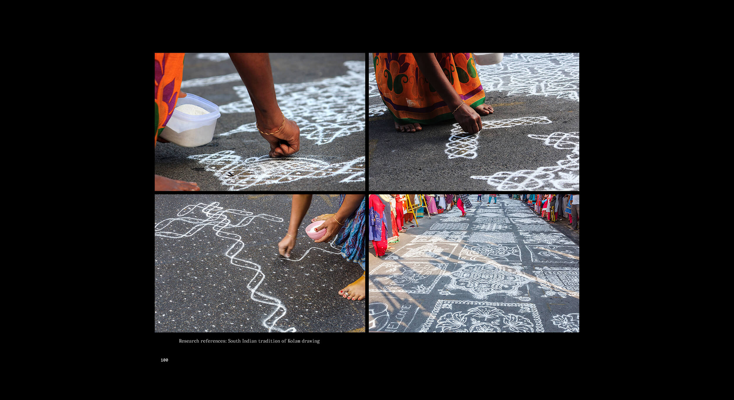
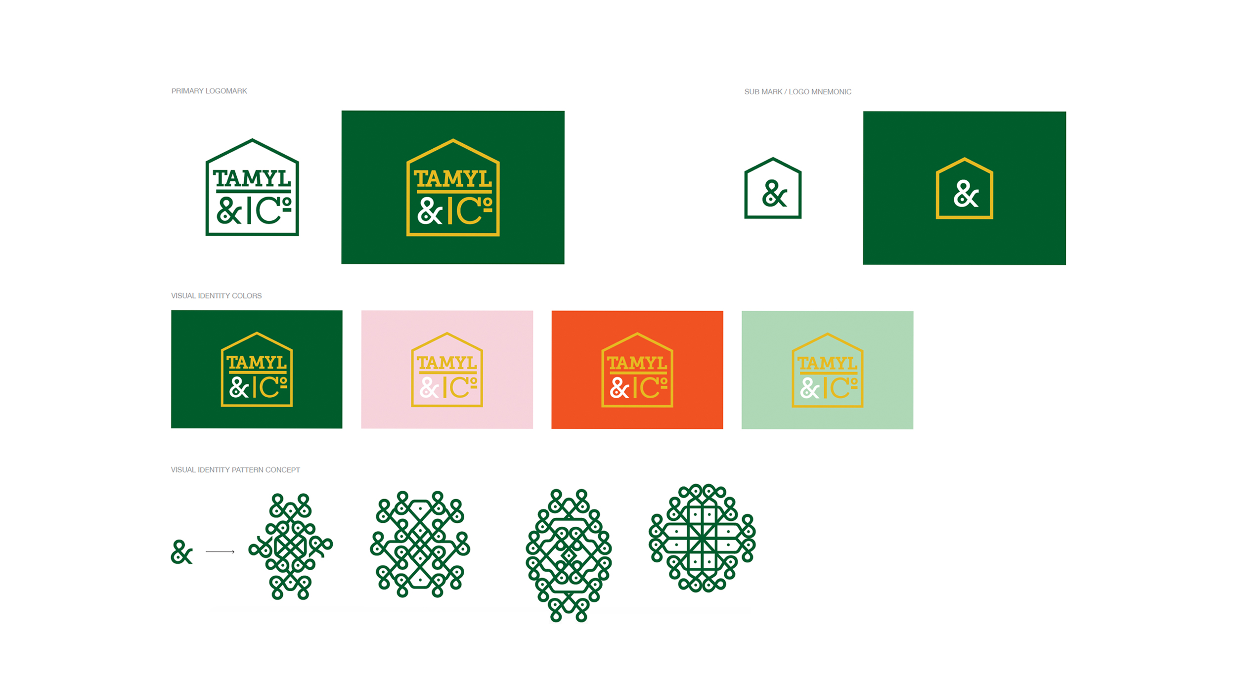
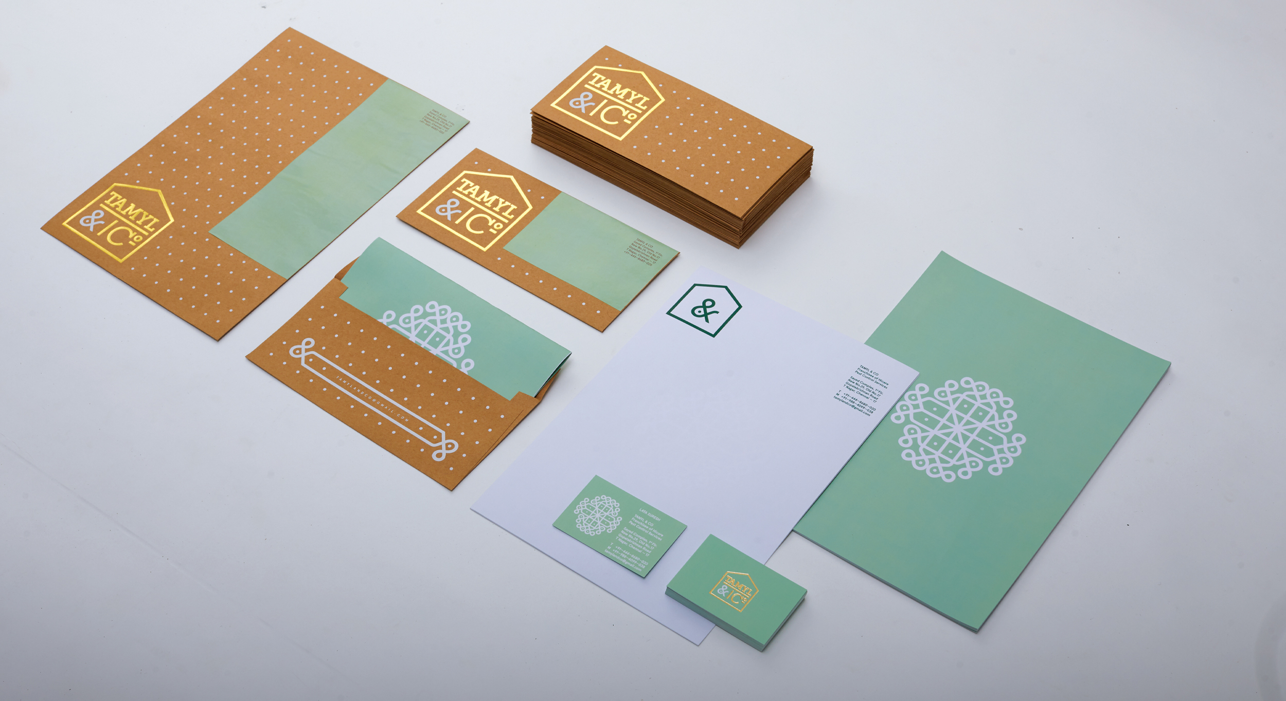
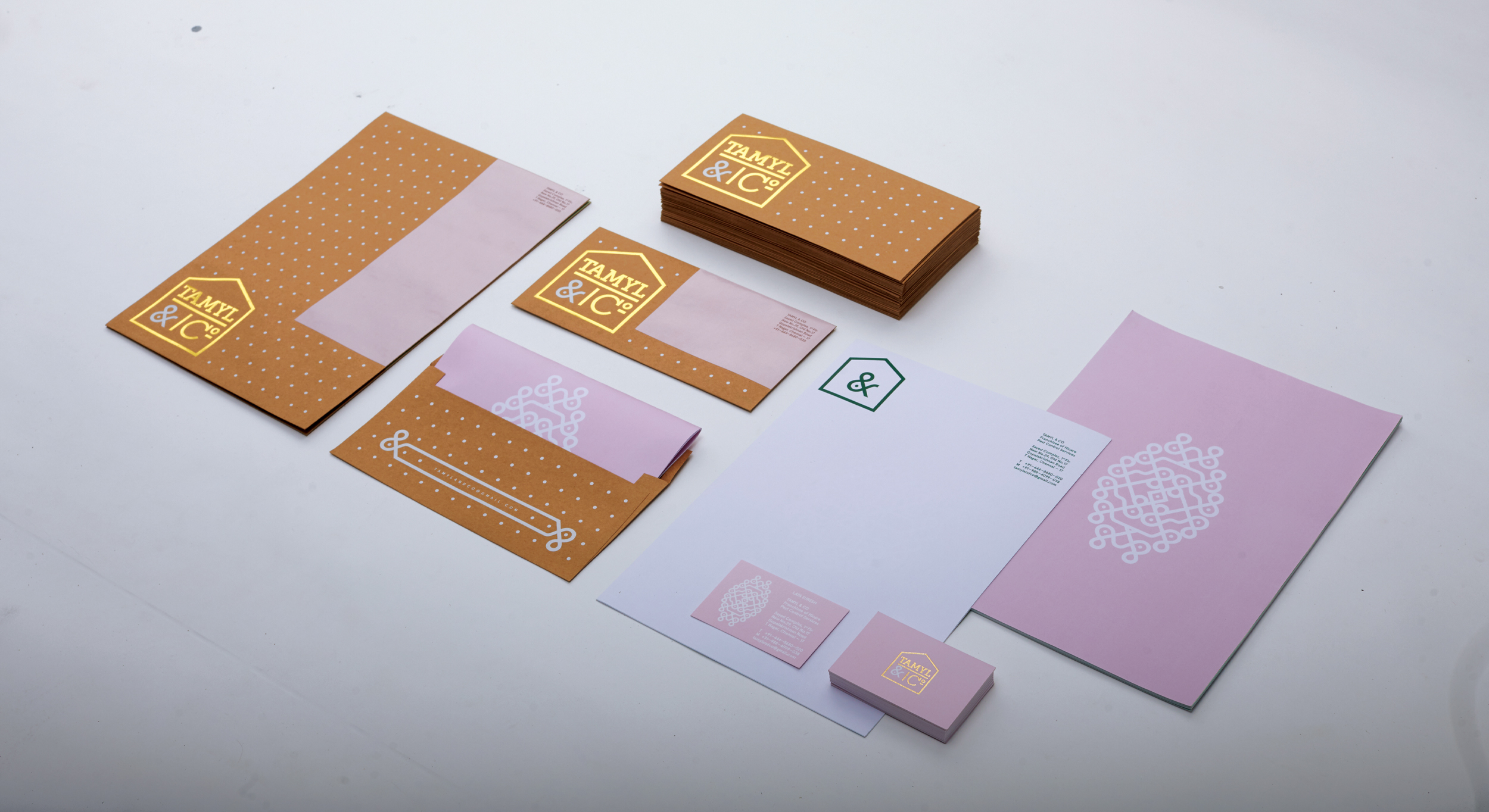
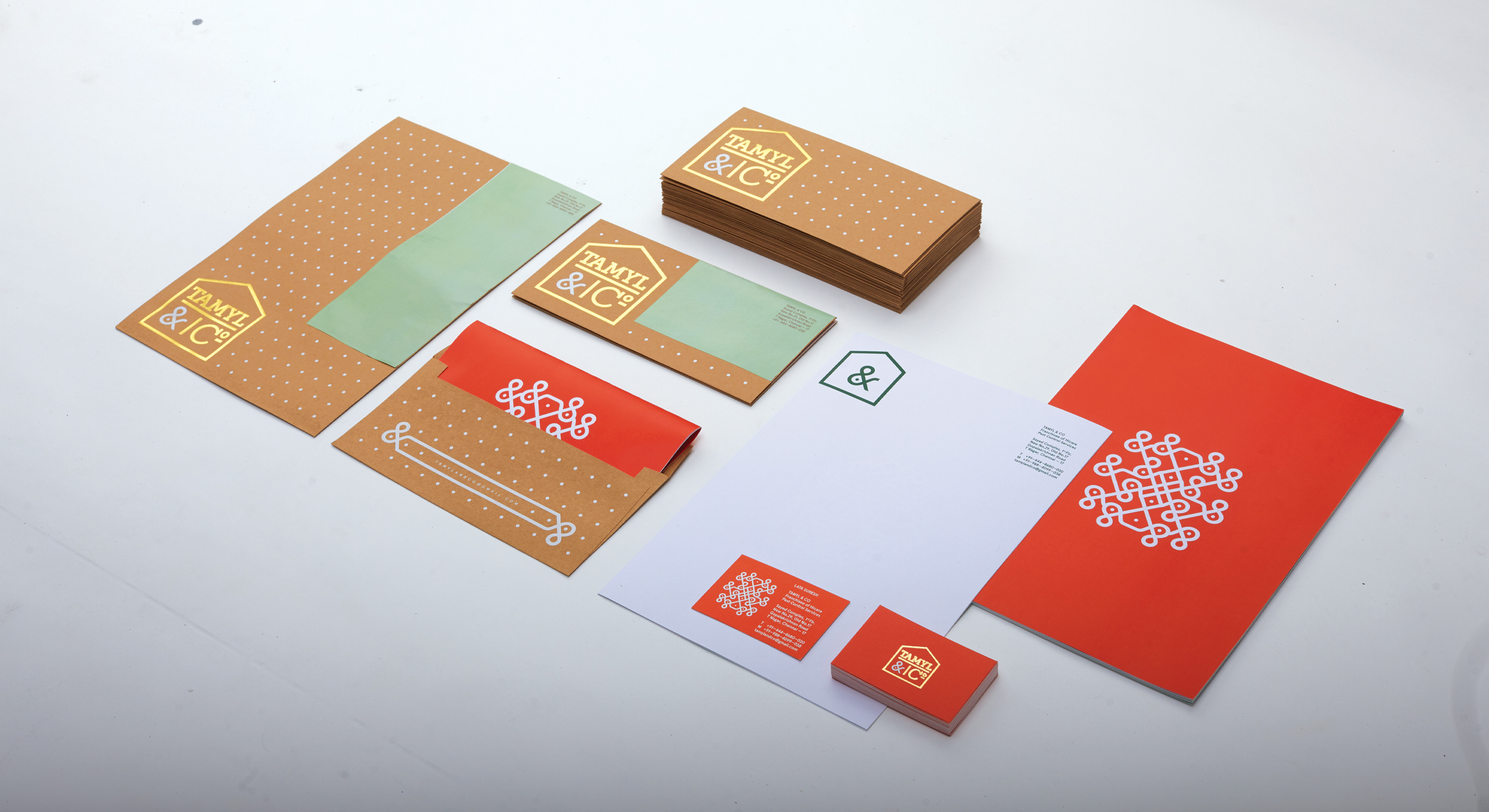
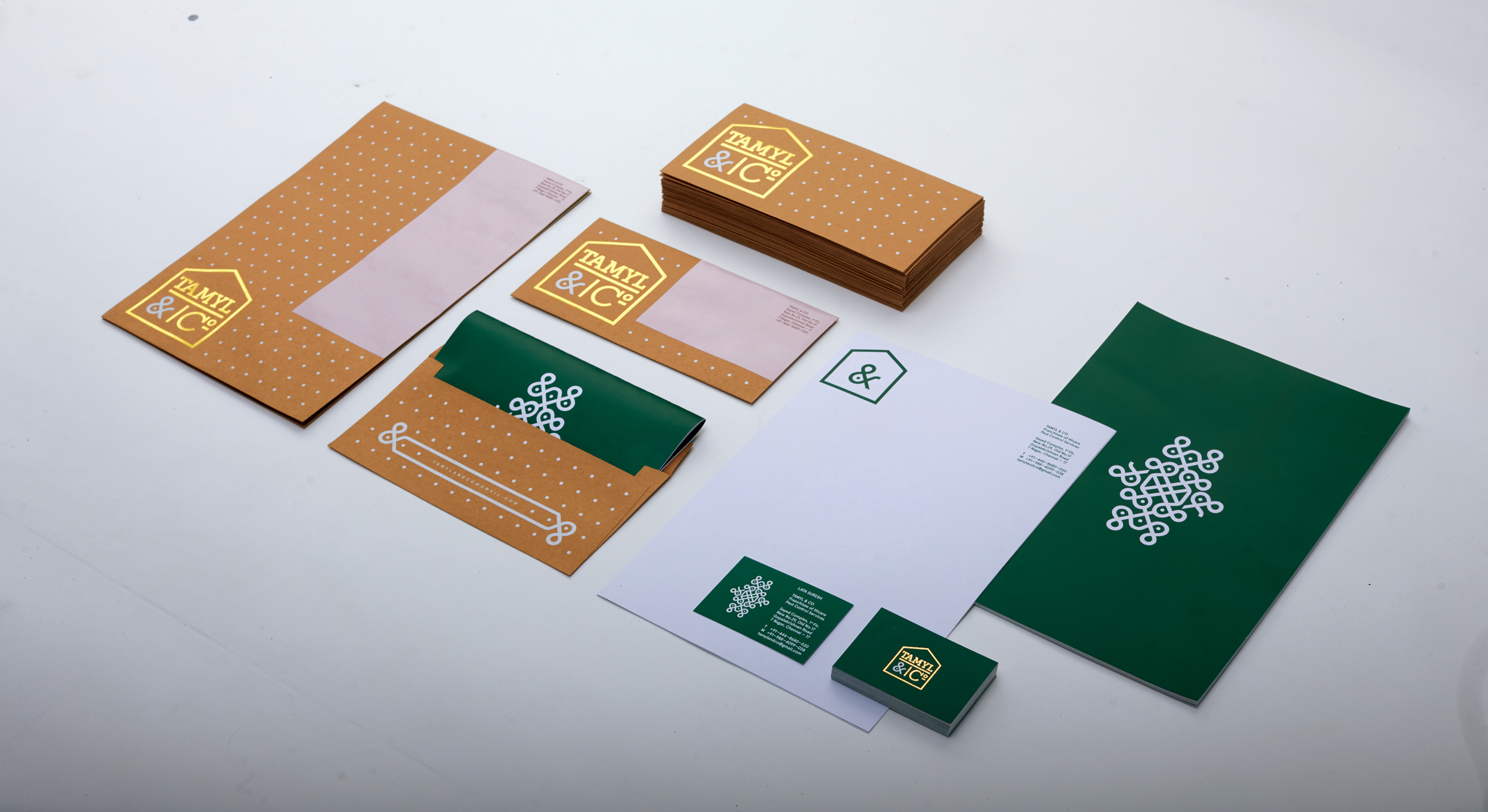
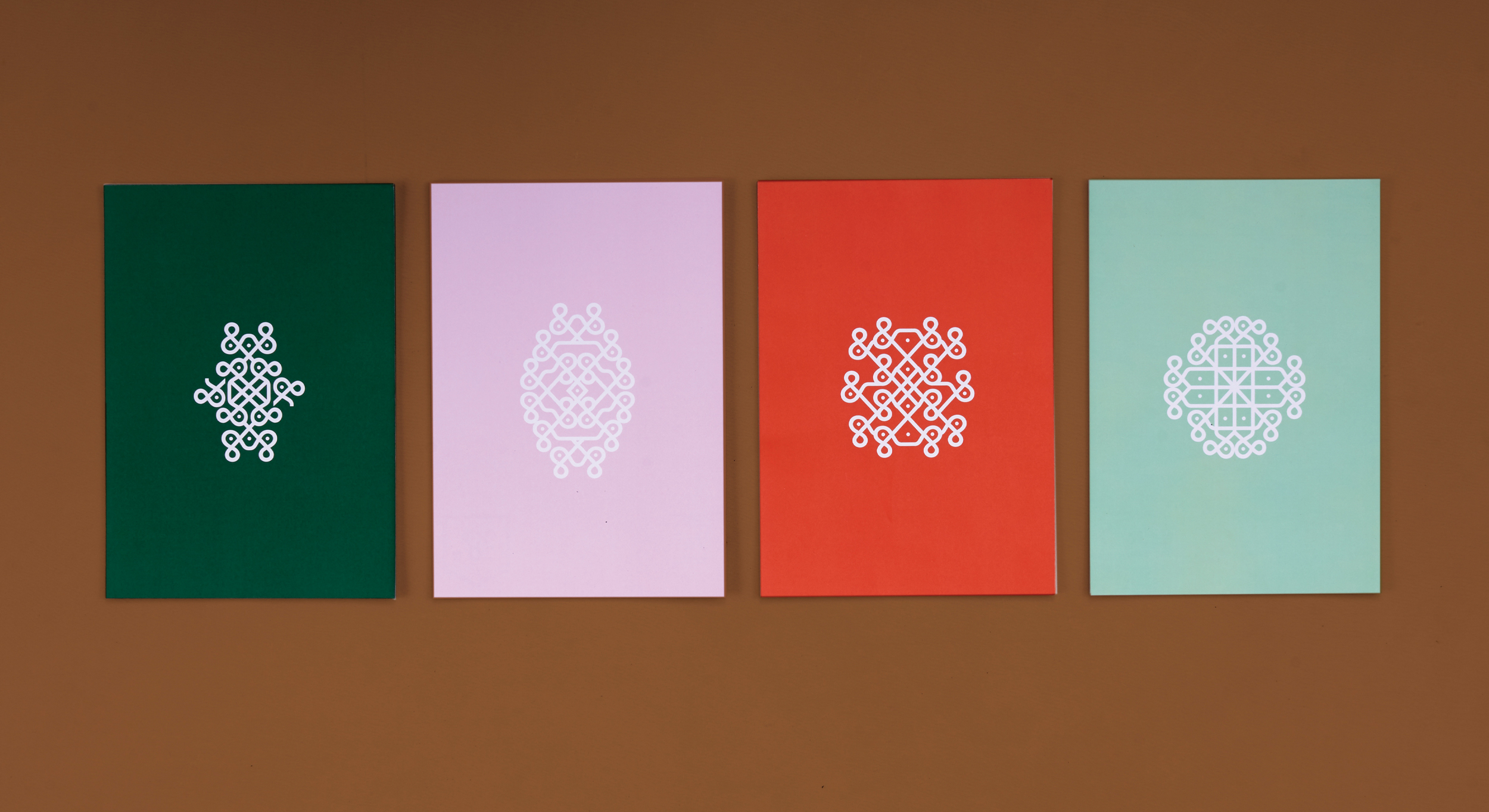
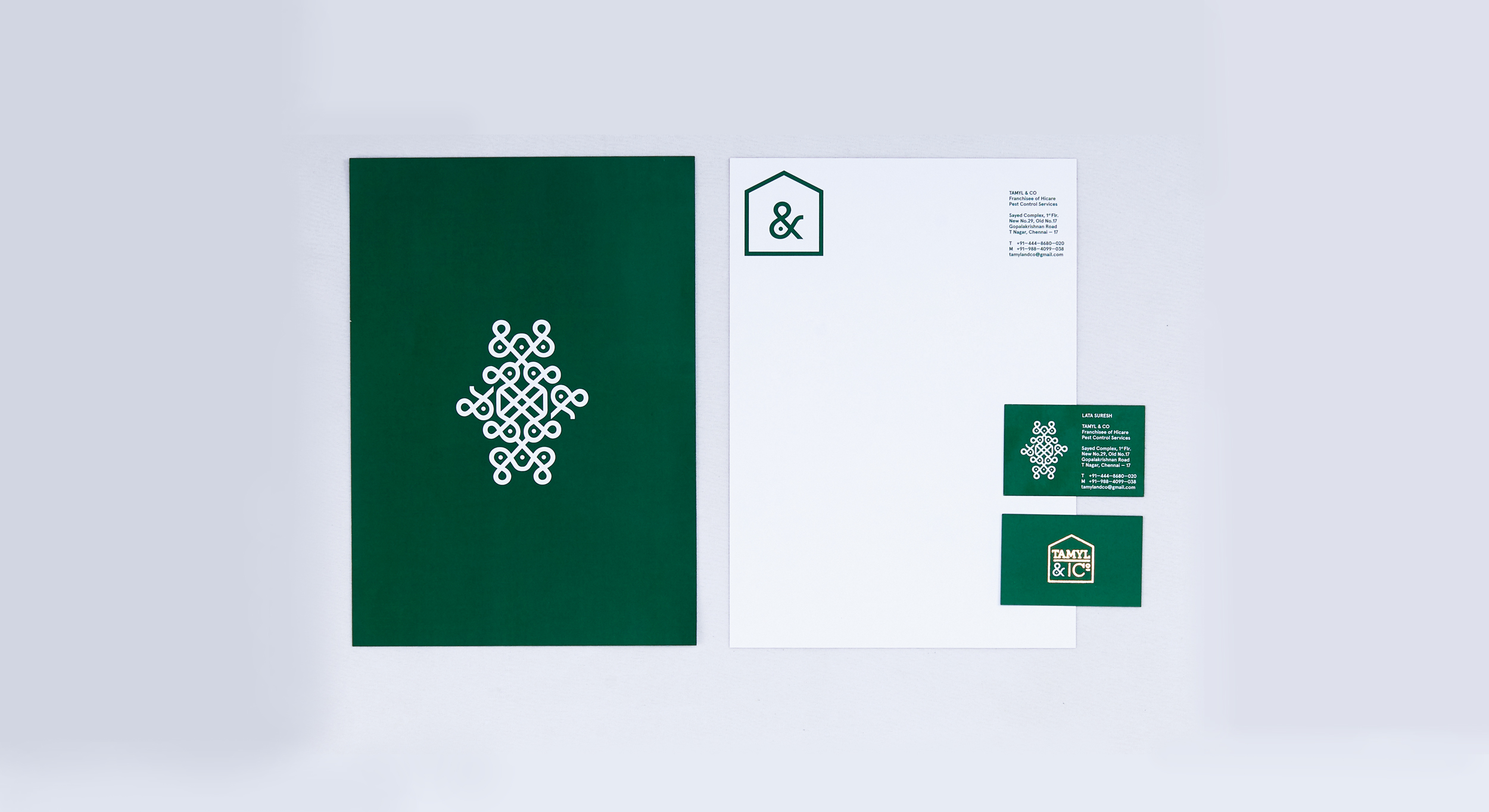
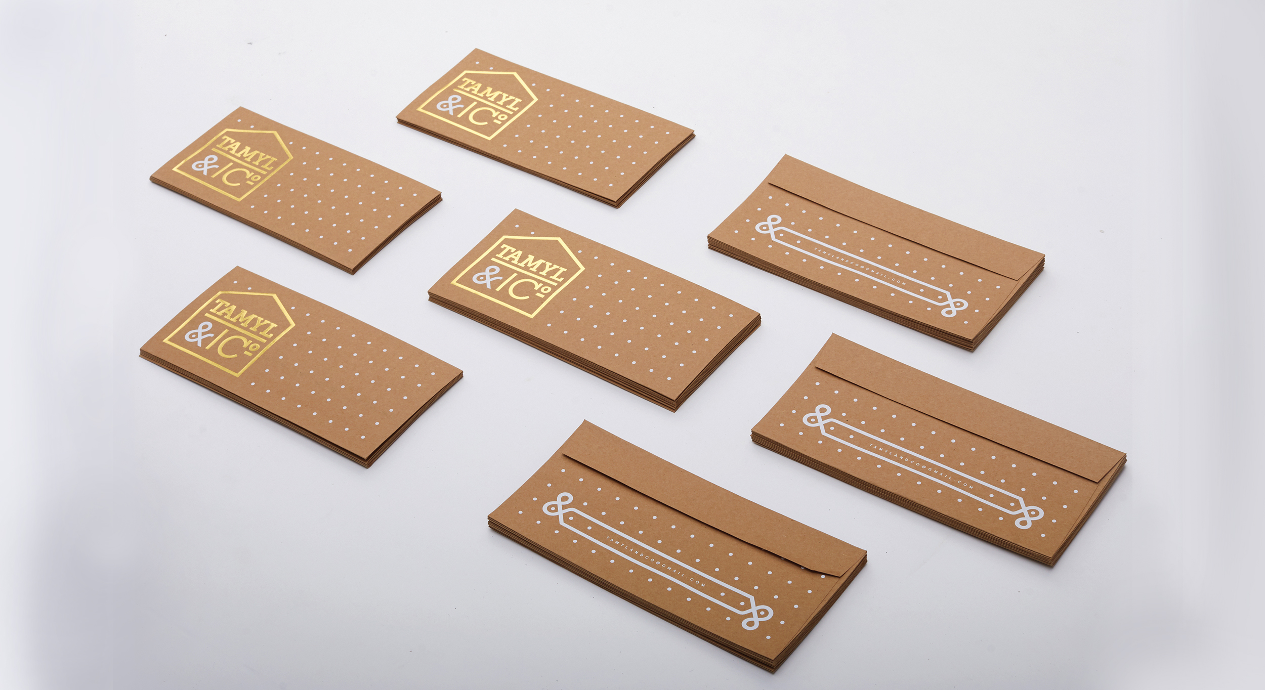
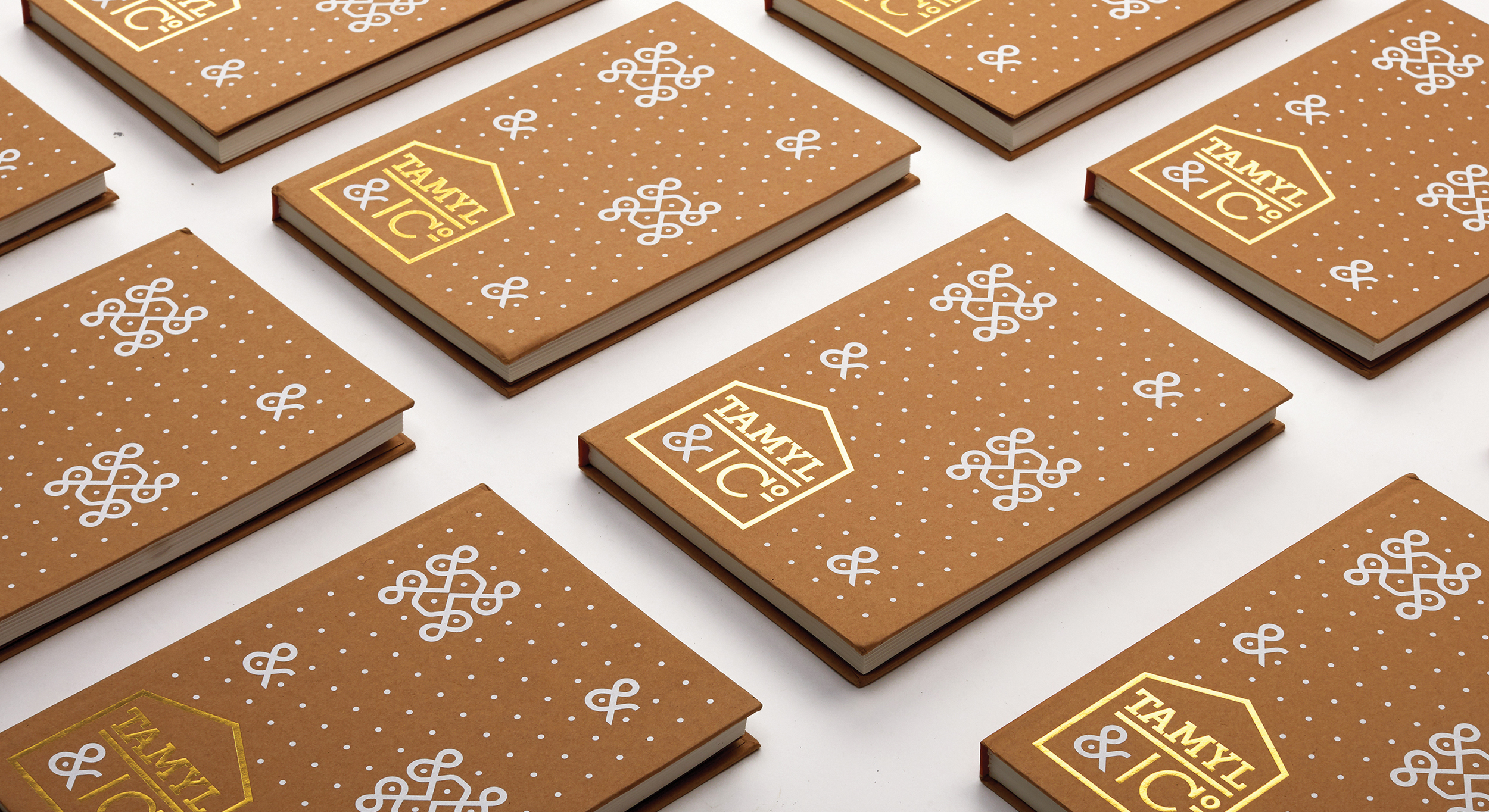
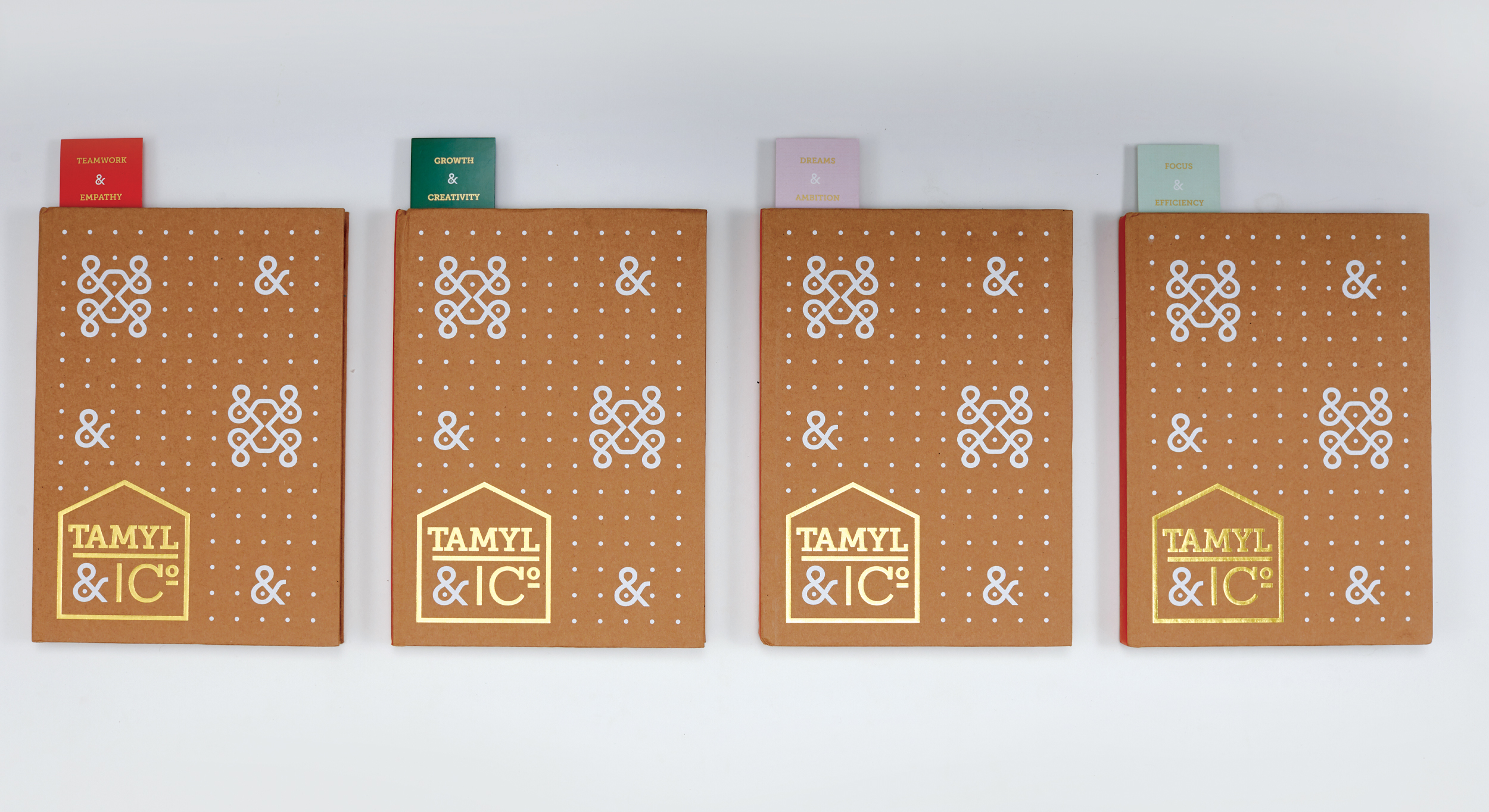
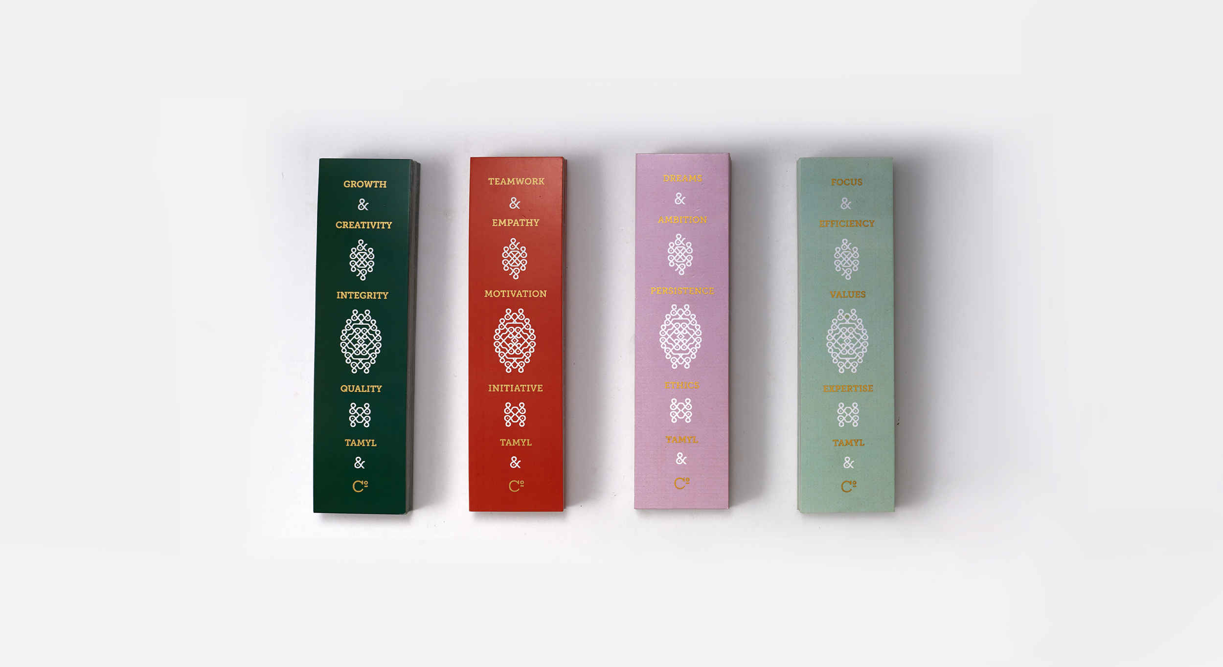
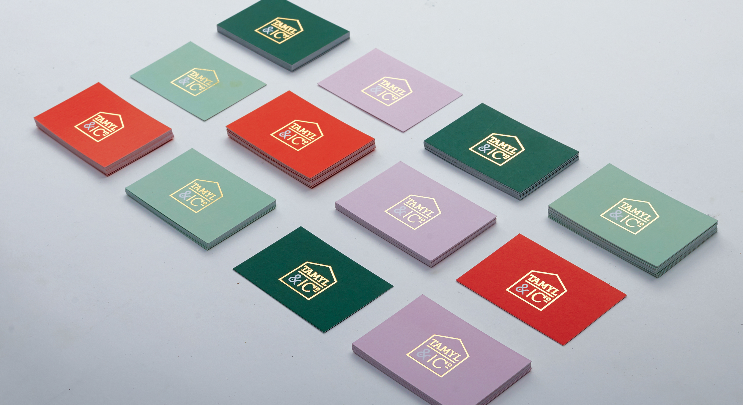
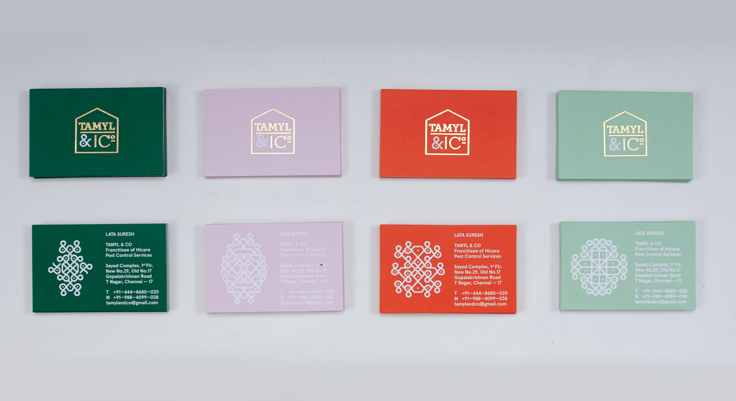
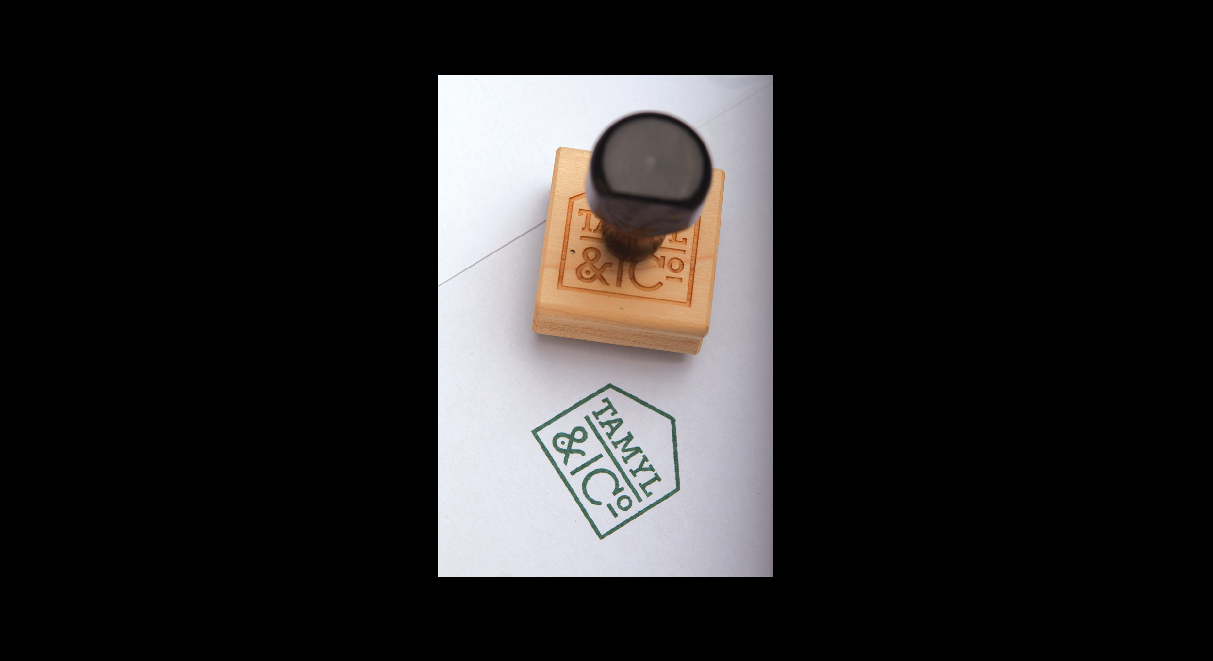
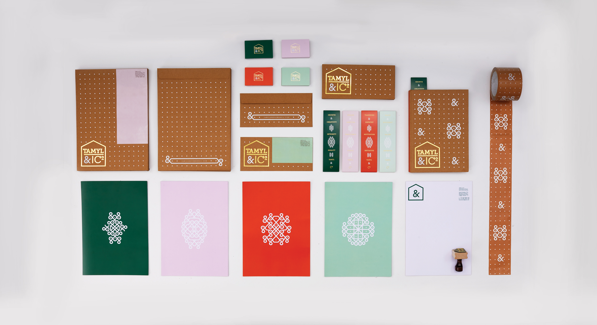
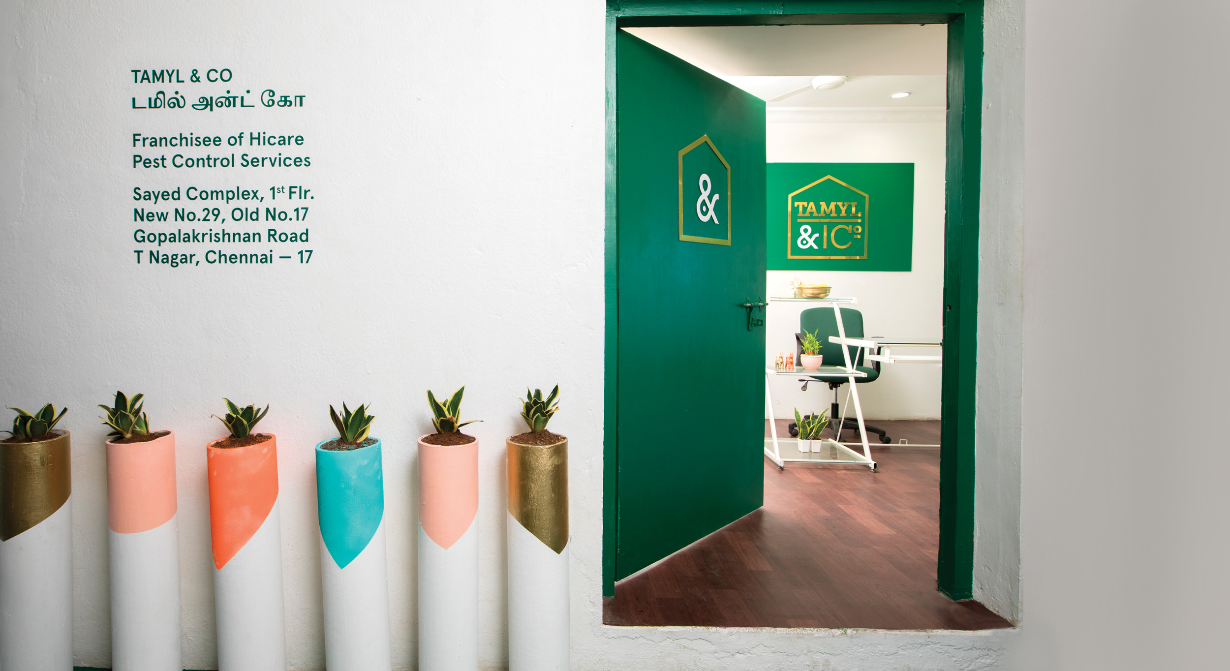
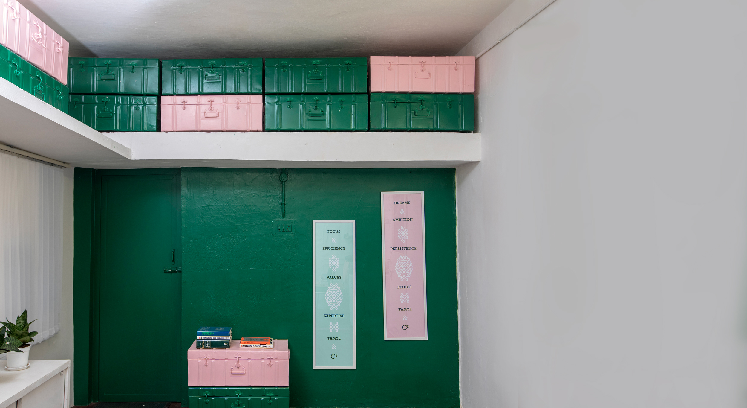
Tamyl & Co is a Chennai-based startup focused on home cleaning and pest management services founded by two women entrepreneurs. ‘Tamyl’ is an anagram of their names and a nod to their Tamilian roots. As pest management can often be viewed as sterile/impersonal, the brief was to create an identity that reflected the founders’ personalities and ideology of traditional values going hand-in-hand with modern home solutions. Drawing from the founders’ deep-rooted South Indian cultural identity, the branding is inspired by the ancient southern tradition of ‘Kolam’ patterns, that are still drawn everyday outside typical Tamilian homes as a welcome symbol of a harmonious household. The ampersand was reinterpreted from the company name, transforming it into a dynamic ‘Kolam-esque’ brand element with a flexible grid system applied across various platforms like stationery, books, signage and wall graphics. The result was a unique cultural synergy, reimagining ancient Kolam art using contemporary typography.
The identity’s brand pattern is based on a simple system of the two arms of the ampersand extending and contracting itself as well as interacting with the dotted grid matrix to form countless patterns reminiscent of Kolam patterns seen in South India.
Tamyl & Co, 2018
Gold foil stamping, Matte vinyl
Branding,Environmental Design,Identity,Print
