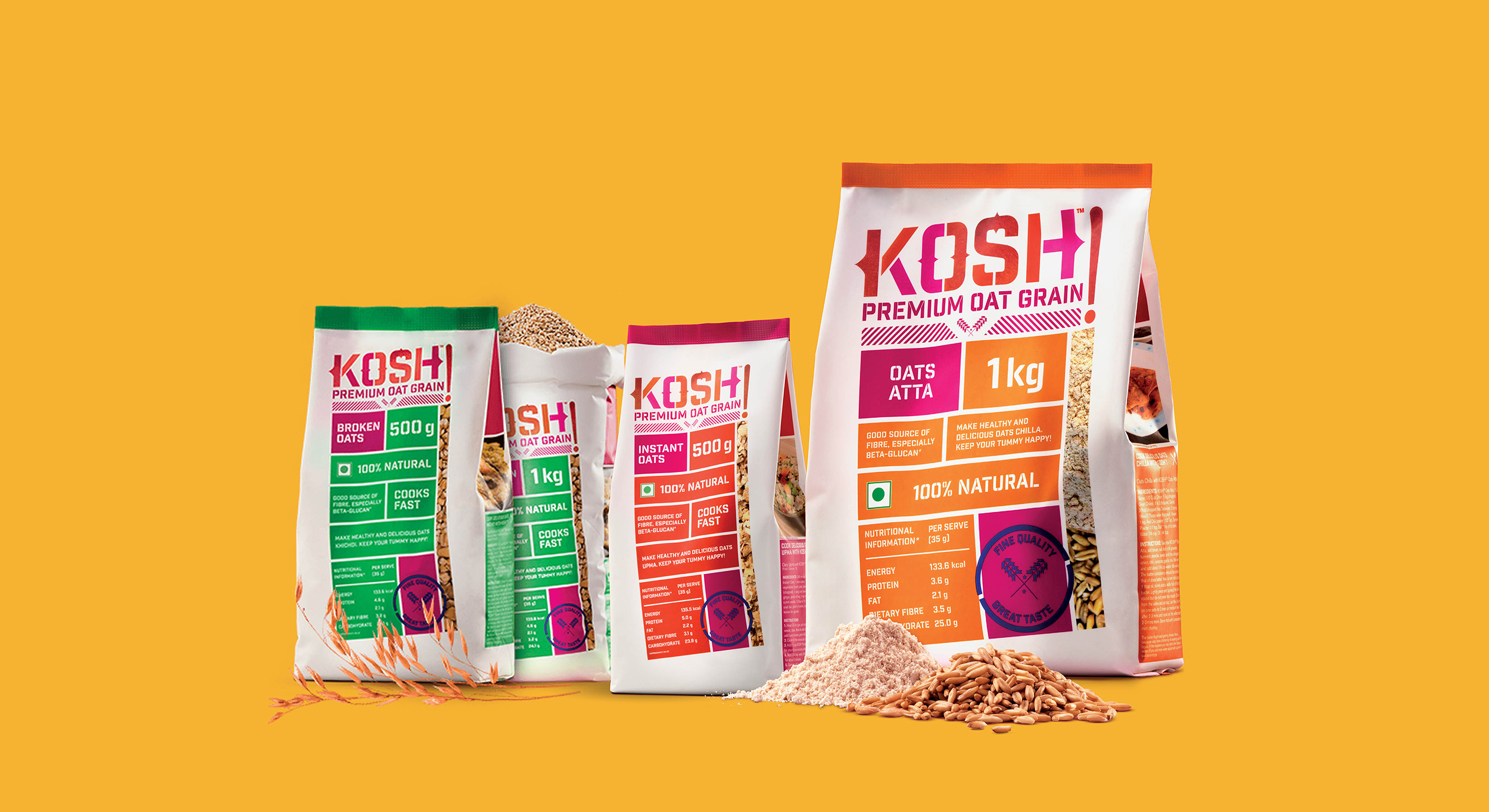
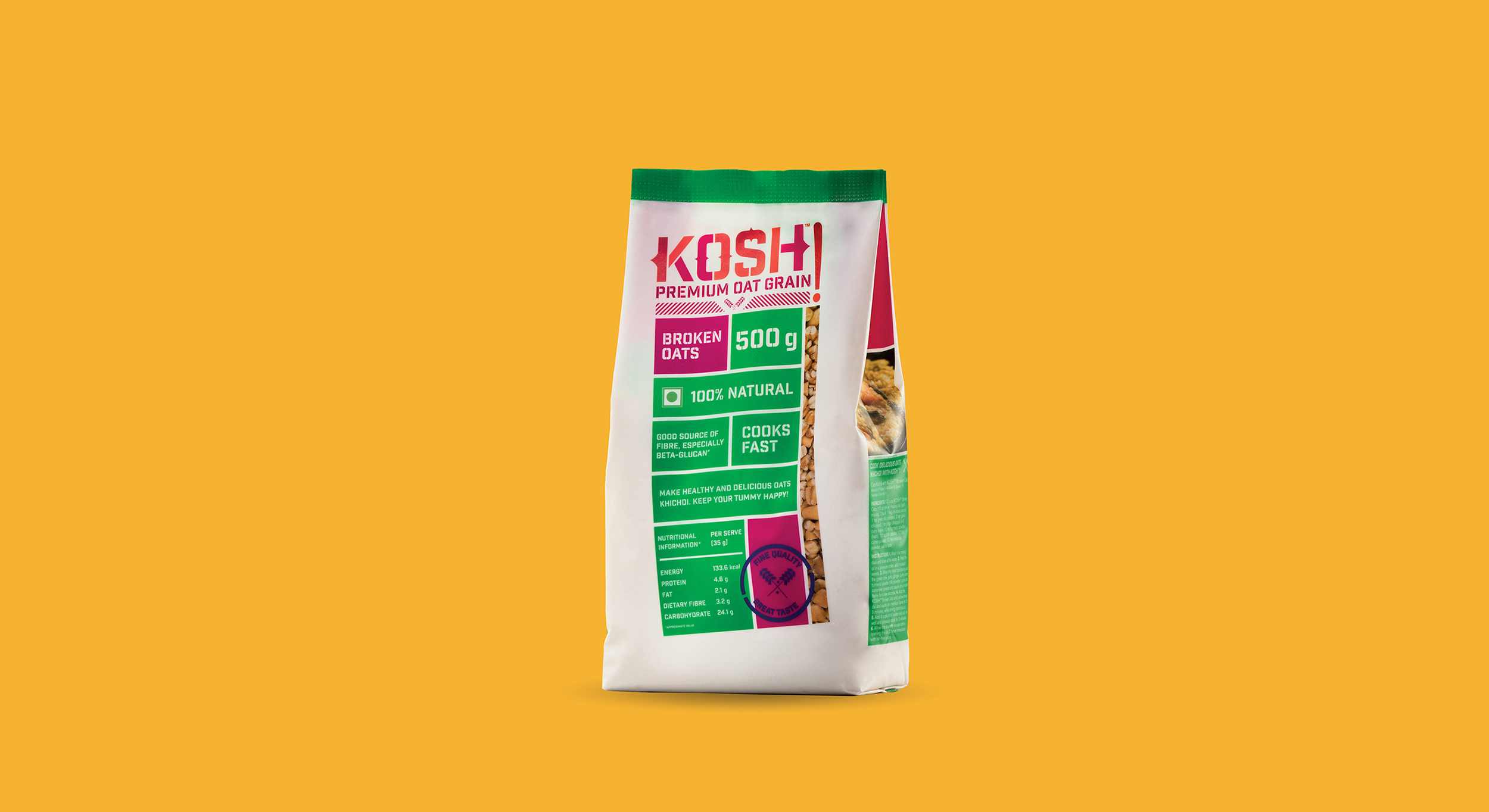
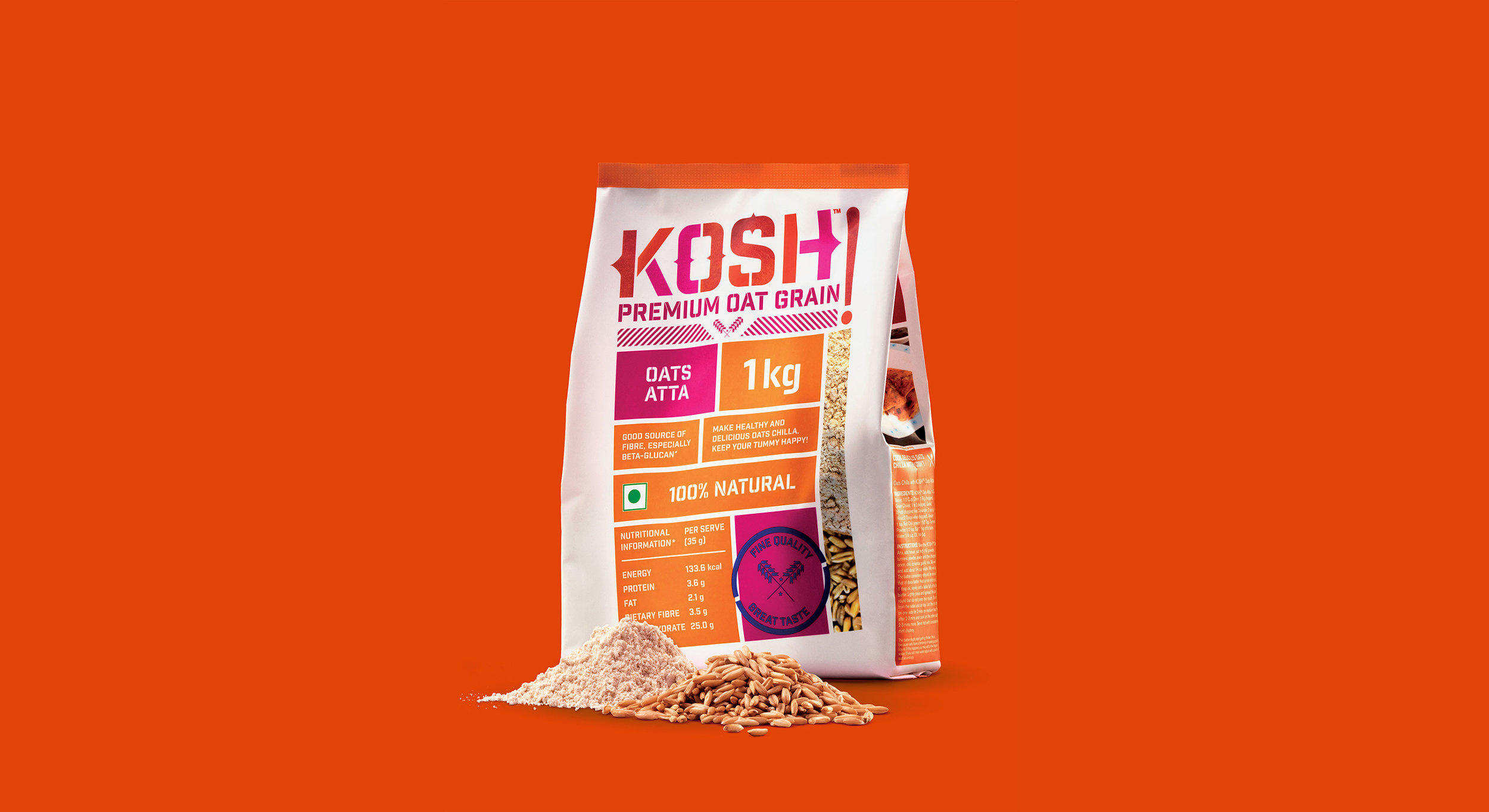
KOSH! is an Indian oats brand by Future Consumer. Given the low oats consumption in India, the brand aimed to establish itself as India’s third staple grain after rice and wheat. The challenge was to develop a brand identity and package design that could spark an instant connect with the Indian consumer for a relatively unfamiliar product and incite excitement to experiment with recipes using oats.We drew inspiration from Indian street typography & Indian vintage industrial, wholesale packaging and re-imagined it in a contemporary context to establish a sense of grass-root familiarity & dependability towards a unfamiliar product.
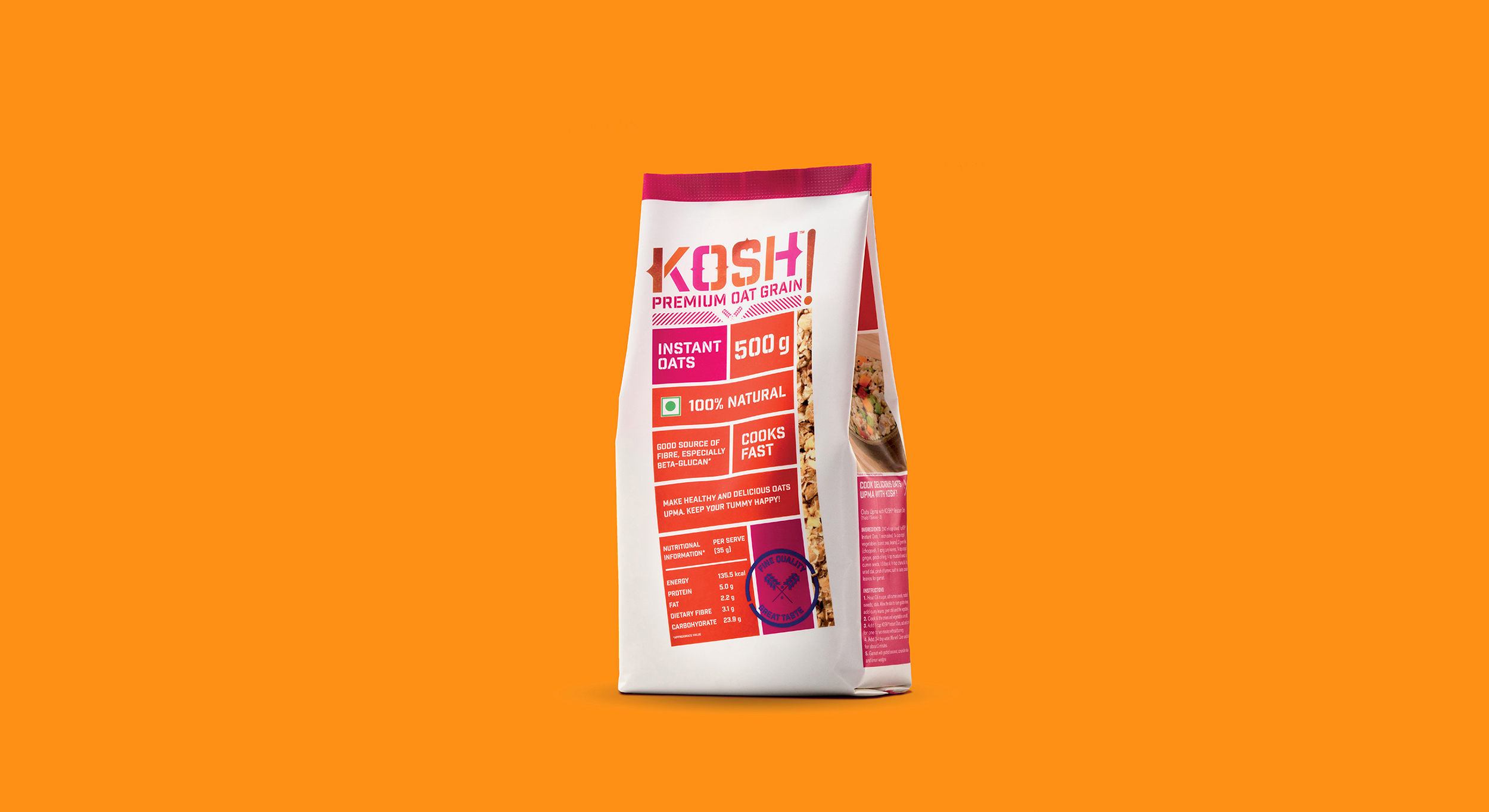
By referencing industrial seals & wholesale materials, and modernizing it the purpose was to create a connection to the collective Indian consciousness of local quality & a sense of belonging. To further establish this connect, the packaging aims to communicate a sense of transparency of the product inside the packaging. Through a series of in-store visits insights were gained on the rising health awareness among consumers, where they often focus on health information and ingredient contents at the back of the packaging, more so than the front label branding. The focus was on re-imagining conventional food packaging formats, bringing helpful nutritional information often lost in the fine print of the back-of-pack to the forefront.
